 Above chart displays the Average Hourly Earnings in US since 1996. As you can see, the slope of the chart is very consistent. The growth in the wages is almost a straight diagonal line from one corner of the chart to the another.
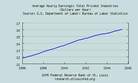
This chart is a linear chart. Unfortunately, a line like above in a linear chart shows slowing growth!! I would like to see some parabolic action in this chart because we have already had parabolic climbs in the housing prices in the US. If the wages do not show any accelerated growth, then some consumer discretionary stocks and housing sector may get into trouble in the coming years.
As always, all disclaimers apply.
2 comments:
If you don't mind, send me an email. I want to talk about Beta and I also want to tell you how to be a part of the Carnival of Personal Finance.
Later,
JLP
AllThingsFinancial-at-hotmail.com
You need to see this chart from the NY Times (via Cafe Hayek) to get the full picture (at least for recent years.) While earnings (hourly wages & salaries) are slowing, total compensation (including benefits) is growing exponentially (properly).
Post a Comment