I have my eyes on a micro cap stock for a few days now. This stock has a market capitalization of about $50 million. It trades for about 5 dollars and change on the NYSE. The trading volume for this stock is about 25,000 to 100,000 shares daily.
When the market opens around 9:30 am, I start monitoring the bid-ask spreads and place a limit order for the price I feel I am comfortable buying the stock; usually a couple of pennies below the bid price. I leave this order for about couple of hours but it never executes. Around lunch time, I try to change the order to something between the bid-ask spread. Still, the order does not get executed. Once I got frustrated and tried to place the limit order on the ask price and still it did not get executed.
I am not sure what is going on here. I have done the above exercise for a couple of days now but there is no luck with this stock. Is market order is a way to go? Is it a good idea to place a market order for a thinly traded micro cap stock?
Tuesday, January 19, 2010
Saturday, March 21, 2009
Monthly mass layoff events in United States
Back in the February of 2008, I noted in the Recession and mass layoffs that if the mass layoffs increase by a lot then it will be a sign of a recession. Since then the mass layoff events in the US have really gone up by a lot, not surprisingly the US in a deep recession right now. It will be very important to keep an eye on this number as we try to recover from this recession because if the economy starts to improve, the mass layoff number should come down or at least stabilize a little.
The chart below shows the mass layoffs in the United States since March 2005. The data table below lists the data used to create the chart.

| Month | Mass layoff events |
| Mar-05 | 1,204 |
| Apr-05 | 1,244 |
| May-05 | 1,264 |
| Jun-05 | 1,196 |
| Jul-05 | 1,241 |
| Aug-05 | 1,143 |
| Sep-05 | 2,250 |
| Oct-05 | 1,109 |
| Nov-05 | 1,162 |
| Dec-05 | 1,263 |
| Jan-06 | 1,112 |
| Feb-06 | 960 |
| Mar-06 | 1,078 |
| Apr-06 | 1,198 |
| May-06 | 1,132 |
| Jun-06 | 1,156 |
| Jul-06 | 1,204 |
| Aug-06 | 1,278 |
| Sep-06 | 1,167 |
| Oct-06 | 1,195 |
| Nov-06 | 1,209 |
| Dec-06 | 1,201 |
| Jan-07 | 1,261 |
| Feb-07 | 1,240 |
| Mar-07 | 1,261 |
| Apr-07 | 1,281 |
| May-07 | 1,200 |
| Jun-07 | 1,256 |
| Jul-07 | 1,288 |
| Aug-07 | 1,262 |
| Sep-07 | 1,279 |
| Oct-07 | 1,346 |
| Nov-07 | 1,352 |
| Dec-07 | 1,469 |
| Jan-08 | 1,476 |
| Feb-08 | 1,669 |
| Mar-08 | 1,585 |
| Apr-08 | 1,344 |
| May-08 | 1,701 |
| Jun-08 | 1,717 |
| Jul-08 | 1,535 |
| Aug-08 | 1,887 |
| Sep-08 | 2,290 |
| Oct-08 | 2,204 |
| Nov-08 | 2,333 |
| Dec-08 | 2,275 |
| Jan-09 | 2,227 |
| Feb-09 | 2,769 |
Datasource: http://www.bls.gov/news.release/mmls.nr0.htm
Median and Average House Prices in United States
The following chart shows the median and average house prices in the United States since 1963. The house prices are listed on the Y scale and the years are listed on the X scale. The data used to produce this chart is listed in the table below the chart.

| Year | Median house price | Average house price |
| 1963 | $18,000 | $19,300 |
| 1964 | $ 18,900 | $20,500 |
| 1965 | $ 20,000 | $21,500 |
| 1966 | $ 21,400 | $23,300 |
| 1967 | $ 22,700 | $24,600 |
| 1968 | $ 24,700 | $26,600 |
| 1969 | $ 25,600 | $27,900 |
| 1970 | $ 23,400 | $26,600 |
| 1971 | $ 25,200 | $28,300 |
| 1972 | $ 27,600 | $30,500 |
| 1973 | $ 32,500 | $35,500 |
| 1974 | $ 35,900 | $38,900 |
| 1975 | $ 39,300 | $42,600 |
| 1976 | $ 44,200 | $48,000 |
| 1977 | $ 48,800 | $54,200 |
| 1978 | $ 55,700 | $62,500 |
| 1979 | $ 62,900 | $71,800 |
| 1980 | $ 64,600 | $76,400 |
| 1981 | $ 68,900 | $83,000 |
| 1982 | $ 69,300 | $83,900 |
| 1983 | $ 75,300 | $89,800 |
| 1984 | $ 79,900 | $97,600 |
| 1985 | $ 84,300 | $100,800 |
| 1986 | $ 92,000 | $111,900 |
| 1987 | $ 104,500 | $127,200 |
| 1988 | $ 112,500 | $138,300 |
| 1989 | $ 120,000 | $148,800 |
| 1990 | $ 122,900 | $149,800 |
| 1991 | $ 120,000 | $147,200 |
| 1992 | $ 121,500 | $144,100 |
| 1993 | $ 126,500 | $147,700 |
| 1994 | $ 130,000 | $154,500 |
| 1995 | $ 133,900 | $158,700 |
| 1996 | $ 140,000 | $166,400 |
| 1997 | $ 146,000 | $176,200 |
| 1998 | $ 152,500 | $181,900 |
| 1999 | $ 161,000 | $195,600 |
| 2000 | $ 169,000 | $207,000 |
| 2001 | $ 175,200 | $213,200 |
| 2002 | $ 187,600 | $228,700 |
| 2003 | $ 195,000 | $246,300 |
| 2004 | $ 221,000 | $274,500 |
| 2005 | $ 240,900 | $297,000 |
| 2006 | $ 246,500 | $305,900 |
| 2007 | $ 247,900 | $313,600 |
| 2008 | $ 231,400 | $292,400 |
Datasource: http://www.census.gov/const/uspriceann.pdf
Sunday, March 15, 2009
Bank of America (BAC) Share Buybacks
How much did Bank of America spend buying back its own stock in the open market in the last decade? The answer will surprise you. It was over $65 Billions. According to the calculations I did by going over the last 10 annual reports (10-K sec filings) of the Bank of America, the company bought back 1,183,126,000 (over 1 Billion) shares in the buyback or repurchase programs over the last 10 years.
BAC was buying back its own stock all the way into late 2007, but it did not buyback a single share in the year 2008. Basically, when the stock price was high, the profits were used to buyback the overpriced shares and when the stock price went down, there was nothing left to buyback the lower priced shares. It is funny how this works out! The current market capitalization of Bank of America is about 36 Billion as I type this. How does that make you feel if you own the stock?
The table below lists the numbers compiled from the annual reports of the Bank of America. If you ask me, this is a bigger scandal. I do not understand why this kind of shenanigans and wrong decisions by management and board are not discussed enough.
Let me tell you why this is a $65 Billion scandal. This is a scandal because the $65 Billion spent on buybacks did not reduce the number of shares outstanding. Look at this quote from the 1999 10-K report. “As of March 15, 1999, there were 1,739,020,301 shares of the registrant's common stock outstanding”. Accounting for the 2:1 split of the 2004, we can say that there were about 3,478,040,602 shares outstanding on the March 15, 1999. Now, look at this quote from the 2007 annual report. “As of February 25, 2008, there were 4,442,228,781 shares of Common Stock outstanding.” This means that after spending $65 Billion on buying back over 1.1 Billion shares from 1999 to 2007, the number of shares outstanding actually went up. It went up by about 1 Billion shares instead of going down by 1 Billion shares. This looks like $130 Billion scandal to me!
Where did all the money go? Why the number of shares outstanding went up by 1 Billion shares? What is going on here? What did the share buybacks accomplished?
| Year ending | Shares bought back | Average price paid | Dollars spent |
| 31-Dec-07 | 73,730,000 | $ 51.42 | $ 3,791,196,600 * |
| 31-Dec-06 | 291,100,000 | $ 49.35 | $14,365,785,000 ** |
| 31-Dec-05 | 126,437,000 | $ 45.61 | $ 5,766,791,570 ** |
| 31-Dec-04 | 147,859,000 | $ 42.52 | $ 6,286,964,680 ** |
| 31-Dec-03 | 129,000,000 | $ 75.76 | $ 9,773,040,000 *** |
| 31-Dec-02 | 109,000,000 | $ 68.55 | $ 7,471,950,000 *** |
| 31-Dec-01 | 82,000,000 | $ 57.58 | $ 4,721,560,000 *** |
| 31-Dec-00 | 146,000,000 | $ 55.74 | $ 8,138,040,000 **** |
| 31-Dec-99 | 78,000,000 | $ 62.28 | $ 4,857,840,000 ***** |
| Totals | 1,183,126,000 | $ 55.09 | $65,173,167,850 |
Sources:
* - Page 8
http://www.sec.gov/Archives/edgar/data/70858/000119312508041665/d10k.htm
** - Page 146
http://www.sec.gov/Archives/edgar/data/70858/000119312507042036/d10k.htm
*** - Page 109
http://www.sec.gov/Archives/edgar/data/70858/000119312504032312/dex13.htm
**** - Page 86
http://www.sec.gov/Archives/edgar/data/70858/000095016801000538/0000950168-01-000538-0001.txt
***** - Page 77 http://www.sec.gov/Archives/edgar/data/70858/0000950168-00-000621.txt
*** - Page 109
http://www.sec.gov/Archives/edgar/data/70858/000119312504032312/dex13.htm
**** - Page 86
http://www.sec.gov/Archives/edgar/data/70858/000095016801000538/0000950168-01-000538-0001.txt
***** - Page 77 http://www.sec.gov/Archives/edgar/data/70858/0000950168-00-000621.txt
Friday, March 06, 2009
Vanguard website troubles
Since Vanguard redesigned the website a little while ago, it has been acting very slow. The site runs extremely slow in Internet Explorer and sometimes it hangs for me. I notice that every time I go to the funds page listed in the screenshot below, my CPU spikes 100% for about 10 seconds and sometimes I have to close my Internet Explorer and start all over again. I have to say that Firefox and Google Chrome work a little better. But, I am not writing about IE vs. Firefox and Chrome here. I am writing about the Vanguard here.
Vanguard is a provider of low cost index funds. Vanguard is all about simplifying the investing process. Vanguard is simple and straightforward. Vanguard's funds are simple and straightforward. Their website needs to be simple. But it is not. Since the last website update, it has been a pain going to their website.
Look at the screenshot below. I filtered how much JavaScript gets loaded on the funds page. 153 KB!!!!. My browser loads 153KB of JavaScript just to show me my daily fund prices. This is too much. Where is the low cost solution for this? It should be 15KB or less, not 153KB. This much bandwidth must be costing a lot of money.
 I also filtered for the total CSS that comes thru. It is 48 KB.
 So, a total of about 200KB of unnecessary (not really necessary) "stuff" comes over the wire when I go to check my fund prices. This is the reason site is too slow.
Update: I looked into this some more and I see that some of JavaScript files are not even minified. The minified JavaScript should speed up the page a little and can save some bandwidth.
Thursday, January 15, 2009
Yield Survey
Treasury rates
30 year - 2.87%
10 year - 2.21%
5 year - 1.37%
2 year - 0.72%
6 month - 0.28%
3 month - 0.10%
1 month - 0.02%
Inflation indexed treasury rates (TIPS)
30 year - 1.96%
10 year - 1.79%
5 year - 2.26%
Online savings account rates
ING direct - 2.50%
HSBC direct - 2.60%
Emigrant direct - 2.50%
GMAC bank - 3.25%
12 month CD rates
ING direct (Orange CD) - 2.75%
HSBC direct - 3.00%
GMAC bank - 3.75%
Bank of America - 2.01% (Standard term CD for less than $10,000)
Money market account rates
Vanguard prime money market (VMMXX) - 2.03%
Vanguard treasury money market (VMPXX) - 0.71%
Fidelity Cash Reserves (FDRXX) - 1.70%
Thursday, November 27, 2008
Volatile TIPS
Just a few months ago I notices in a post that 5-year TIPS were yielding 0% before inflation. I remarked at that point, “Investors in the 5-year TIPS are accepting government reported inflation numbers as their future return”
Now look what has happened since then. The 5-year TIPS are now yielding 3.92% real before the inflation. The inflation component that Government will have to pay will be extra. The 5-year treasury is yielding 2.10%. Crazy times!
Here is the picture from Pimco.

Now look what has happened since then. The 5-year TIPS are now yielding 3.92% real before the inflation. The inflation component that Government will have to pay will be extra. The 5-year treasury is yielding 2.10%. Crazy times!
Here is the picture from Pimco.

Excessive Executive Compensation
When the history books will be written about this market there should be a chapter on the excessive executive compensation in terms of stock options as one of the reason for this market crash in the big picture terms. The excessive stock options to executives created a short-term oriented mindset where meeting the quarterly numbers was the only goal. It was acceptable to leverage the balance sheet 30 to 1 or 40 to 1 just to meet or exceed the quarterly numbers and move the stock up so that the executives can cash in the stock options.
The current talk coming out of the congress about the excessive executive compensation and golden parachutes is equivalent to closing the barn door after the horses are gone. The executives have already made billions and billions risking the entire American enterprise!!
The current talk coming out of the congress about the excessive executive compensation and golden parachutes is equivalent to closing the barn door after the horses are gone. The executives have already made billions and billions risking the entire American enterprise!!
Thursday, October 09, 2008
Larry Kudlow
"We believe the free market capitalism is the best path to prosperity"
- Larry Kudlow
(The first line of Larry Kudlow's show, "Kudlow & company" on CNBC, in years 2007 and 2008)
- Larry Kudlow
(The first line of Larry Kudlow's show, "Kudlow & company" on CNBC, in years 2007 and 2008)
Sunday, July 13, 2008
Vanguard index fund 3-year returns
The table below lists the 3-year annualized returns of the Vanguard Index funds. I have included the index funds that have been in the business for at least 3-years. The 3-year performance displayed below is as of 6/30/2008 and data is from the Vanguard’s website. The performance quoted also includes the dividends paid out by these index funds.
As you can see from the table, the small cap funds and value funds are already underperforming the growth and large caps for 3-years now. The long awaited large cap outperformance relative to small caps is going on for 3 years already. International index funds were the best performers in the last 3 years. It will be interesting to see how far the international outperformance continues. If I have to guess I will say that when I will make this table 3 years from now, I will probably see domestic index funds sitting on the top and international index funds will show low relative returns to the domestic index funds. That is my guess but we will have to wait and see.
As you can see from the table, the small cap funds and value funds are already underperforming the growth and large caps for 3-years now. The long awaited large cap outperformance relative to small caps is going on for 3 years already. International index funds were the best performers in the last 3 years. It will be interesting to see how far the international outperformance continues. If I have to guess I will say that when I will make this table 3 years from now, I will probably see domestic index funds sitting on the top and international index funds will show low relative returns to the domestic index funds. That is my guess but we will have to wait and see.
| Symbol | Index Fund Name | 3-year Average Annual Returns |
| VEIEX | Emerging Market Stock Index Fund | 25.64% |
| VGTSX | Total International Stock Index Fund | 14.94% |
| VEURX | European Stock Index Fund | 13.60% |
| VDMIX | Developed Markets Index Fund | 12.91% |
| VPACX | Pacific Stock Index Fund | 11.53% |
| VISGX | Small Cap Growth Index Fund | 7.65% |
| VIGRX | Growth Index Fund | 6.44% |
| VIMSX | Mid Cap Index Fund | 6.72% |
| VEXMX | Extended Market Index Fund | 6.11% |
| VLACX | Large Cap Index Fund | 5.00% |
| VTSMX | Total Stock Market Index Fund | 4.88% |
| VFINX | 500 Index Fund | 4.28% |
| VGSIX | REIT Index Fund | 4.72% |
| NAESX | Small Cap Index Fund | 4.55% |
| VIVAX | Value Index Fund | 3.34% |
| VISVX | Small Cap Value Index Fund | 1.28% |
Saturday, June 28, 2008
Free cash flow and share buybacks
I was looking through the cash flow statements of Pepsi for the last 10-years at the morningstar’s website and I saw that Pepsi has been buying back its stock consistently for the last 10 years.
I summed up all dollars Pepsi spent on stock buybacks for the last 10-years. The total was around $16 Billion dollars. Wow! Pepsi spent $16 Billion dollars to buyback its stock in the last 10-years. After calculating this, I wanted to see how much the total share count has decreased over the last decade. To see this, I switched to the income statements on the Morningstar’s website. There I saw that the total share count has not decreased at all. Instead it has gone up about 80 million shares in the last decade. In 1998, Pepsi had about 1.52 Billion shares outstanding, and in 2008 Pepsi has about 1.60 Billion shares outstanding.
So, where did $16 Billion spent on the share buybacks go? If a company spends $16 Billion of its free-cash flow to buyback shares then share count has to go down, doesn’t it?
But, my guess is that Pepsi is simply buying its own stock to neutralize the dilution created when the executives and employees exercise the stock options. So, in other words the share buyback is a systematic transfer of wealth from shareholders to employees and executives.
I am sure many company’s cash flow statements will show this type of shenanigans. I will try to post more cases as I find them because I am currently going through a lot of financial statements and I am sure I will come across more of this.
From now on, when I will calculate free-cash flow I will deduct the amount spent on share repurchases from the free-cash flow if the number of shares do not go down from the year before. How does that sound?
Datasources:
http://quicktake.morningstar.com/StockNet/cashflow10.aspx?Country=USA&Symbol=PEP
http://quicktake.morningstar.com/StockNet/income10.aspx?Country=USA&Symbol=PEP
Tuesday, March 25, 2008
Largest mutual funds and their expenses
The table below lists the 25 largest mutual funds, their expense ratios and the total expense the shareholders in these mutual funds incur each year. The total expense the shareholders incur in a given year is dependant on the expense ratio of the fund and the total dollars invested in the fund by the shareholders. This number also reflects the amount of money the parent company earns in revenues for running that particular mutual fund.
As you can see from the table below, the largest mutual fund in United States is the American Funds Growth Fund of America with total net assets of about $85 billion dollars. This is just the A shares of this mutual fund. The table below does not account for the B, C or any other share classes this fund may have. The class ‘A’ shares alone has about $85 billion in assets. The expense ratio of this fund is 0.62%. Multiply the total assets $85 billion with 0.62% and you get about $530 million dollars. This is how much the shareholders of the Growth Fund of America pay the American Funds to run the fund operations. This also means that the American Funds also gets $530 million dollars a year to manager other people’s money.
The Vanguard group normally has the lowest expense ratios for their funds because of the Vanguard’s unique ownership structure. You could say that the shareholders of the Vanguard funds collectively own the Vanguard group. The largest mutual fund from the Vanguard group that made the list is the 500 index fund, which has a paltry 0.18% expense ratio. The shareholders pay only about $102 million in expenses for their collective $57 billion invested in the 500 index fund. I have recently noticed that the Vanguard mutual fund expense ratios have gone down even some more.
The 25 largest mutual funds hold about $1.3 trillion in total assets and mutual fund shareholders pay a total of $7.2 billion dollars in expenses. One thing to notice from the table below is that every one of the 25 largest mutual funds has expense ration below 1%. That is the good news. The bad news is that many funds from the table are class ‘A’ funds. That means that shareholders paid hefty front loads to be able to invest in them. All of the American funds are class A funds.
Datasource: MSN Moneycentral mutual fund screener as of March 25, 2008
As you can see from the table below, the largest mutual fund in United States is the American Funds Growth Fund of America with total net assets of about $85 billion dollars. This is just the A shares of this mutual fund. The table below does not account for the B, C or any other share classes this fund may have. The class ‘A’ shares alone has about $85 billion in assets. The expense ratio of this fund is 0.62%. Multiply the total assets $85 billion with 0.62% and you get about $530 million dollars. This is how much the shareholders of the Growth Fund of America pay the American Funds to run the fund operations. This also means that the American Funds also gets $530 million dollars a year to manager other people’s money.
The Vanguard group normally has the lowest expense ratios for their funds because of the Vanguard’s unique ownership structure. You could say that the shareholders of the Vanguard funds collectively own the Vanguard group. The largest mutual fund from the Vanguard group that made the list is the 500 index fund, which has a paltry 0.18% expense ratio. The shareholders pay only about $102 million in expenses for their collective $57 billion invested in the 500 index fund. I have recently noticed that the Vanguard mutual fund expense ratios have gone down even some more.
| Symbol | Fund Name | Total Net Assets | Expense Ratio | Total Expenses Paid By Shareholders |
| AGTHX | American Funds Growth Fund of America A | $85,618,712,576 | 0.62 | $530,836,018 |
| CAIBX | American Funds Capital Income Builder A | $78,065,221,632 | 0.55 | $429,358,719 |
| CWGIX | American Funds Capital World G/I A | $77,768,237,056 | 0.69 | $536,600,836 |
| PTTRX | PIMCO Total Return Instl | $75,467,661,312 | 0.43 | $324,510,944 |
| FCNTX | Fidelity Contrafund | $72,805,416,960 | 0.89 | $647,968,211 |
| AIVSX | American Funds Investment Co of Amer A | $69,176,573,952 | 0.54 | $373,553,499 |
| AMECX | American Funds Income Fund of Amer A | $63,430,389,760 | 0.54 | $342,524,105 |
| AWSHX | American Funds Washington Mutual A | $61,855,260,672 | 0.57 | $352,574,986 |
| AEPGX | American Funds EuroPacific Growth A | $58,035,060,736 | 0.75 | $435,262,956 |
| VFINX | Vanguard 500 Index | $57,096,368,128 | 0.18 | $102,773,463 |
| DODGX | Dodge & Cox Stock | $56,480,501,760 | 0.52 | $293,698,609 |
| FDIVX | Fidelity Diversified International | $50,760,208,384 | 0.91 | $461,917,896 |
| DODFX | Dodge & Cox International Stock | $49,587,798,016 | 0.66 | $327,279,467 |
| VTSMX | Vanguard Total Stock Mkt Idx | $48,000,520,192 | 0.19 | $91,200,988 |
| ANWPX | American Funds New Perspective A | $45,675,159,552 | 0.70 | $319,726,117 |
| VINIX | Vanguard Institutional Index | $42,257,670,144 | 0.05 | $21,128,835 |
| FMAGX | Fidelity Magellan | $39,363,391,488 | 0.53 | $208,625,975 |
| ABALX | American Funds American Balanced A | $36,892,069,888 | 0.58 | $213,974,005 |
| ANCFX | American Funds Fundamental Invs A | $36,704,739,328 | 0.58 | $212,887,488 |
| VFIAX | Vanguard 500 Index Adm | $33,773,611,008 | 0.09 | $30,396,250 |
| FDGRX | Fidelity Growth Company | $33,291,870,208 | 0.96 | $319,601,954 |
| FKINX | Franklin Income A | $33,200,670,720 | 0.63 | $209,164,226 |
| FLPSX | Fidelity Low-Priced Stock | $31,330,760,704 | 0.96 | $300,775,303 |
| VBMFX | Vanguard Total Bond Market Index | $30,592,569,344 | 0.20 | $61,185,139 |
| VWELX | Vanguard Wellington | $29,890,820,096 | 0.27 | $80,705,214 |
| - | Totals | $1,297,121,263,616 | - | $7,228,231,201 |
The 25 largest mutual funds hold about $1.3 trillion in total assets and mutual fund shareholders pay a total of $7.2 billion dollars in expenses. One thing to notice from the table below is that every one of the 25 largest mutual funds has expense ration below 1%. That is the good news. The bad news is that many funds from the table are class ‘A’ funds. That means that shareholders paid hefty front loads to be able to invest in them. All of the American funds are class A funds.
Datasource: MSN Moneycentral mutual fund screener as of March 25, 2008
Saturday, March 15, 2008
10-year index fund returns
The table below lists the 10-year performance as of 2/29/2008 of all the Vanguard index funds where 10-year performance data is available. I have included all bond index funds, a balanced funds and a bunch of international funds along with domestic index funds.
The table is sorted by the 10-year performance in the descending order. The best performing index fund for the last 10-years is listed at the top of the table and worst performing index fund is listed at the bottom of the table. As you can see from the table that the Vanguard emerging market stock index fund had the best performance record in the last 10-years, and the Vanguard growth index fund had the worst performance record in the last 10-years.
Now, let’s think about some history. Try to put yourself in the 1998 mindset again. 1998 was right after or during the Asian stock market crisis. During that time many emerging market stocks collapsed. After 10-years of hindsight, it looks like that it was the best time to invest in a emerging market stock index fund. At the same time, in 1998 the US stock market was soaring with high growth technology stocks leading the way. The technology stocks still had couple of years of huge run ups still left in them at that time. Everyone was investing high growth technology stocks at that time. It was precisely the wrong time to invest in those technology stocks. The technology stocks accounted for something like 30%-40% of the S&P 500 index from 1998 to 2000. Because of that the S&P 500 index also lagged behind other investment options in the last 10-years.
The important question today is, where is the best place to invest for the next 10-years. Are you investing in emerging markets today? Are you tilting your portfolio towards international stocks? Are you staying away from large growth index like S&P 500 index?
Datasource: https://personal.vanguard.com/us/funds/vanguard/index?loc=&View=PP&Sc=0
The table is sorted by the 10-year performance in the descending order. The best performing index fund for the last 10-years is listed at the top of the table and worst performing index fund is listed at the bottom of the table. As you can see from the table that the Vanguard emerging market stock index fund had the best performance record in the last 10-years, and the Vanguard growth index fund had the worst performance record in the last 10-years.
| Vanguard index Fund Name | Symbol | 10-year Average Annual Total Returns as of 2/29/2008 |
| Emerging market stock index fund | VEIEX | 13.80% |
| REIT index fund | VGSIX | 10.10% |
| Total international stock index fund | VGTSX | 7.46% |
| European stock index fund | VEURX | 7.31% |
| Long term bond index fund | VBLTX | 6.97% |
| Intermediate term bond index fund | VBIIX | 6.50% |
| Small cap index fund | NAESX | 6.18% |
| Extended market index fund | VEXMX | 6.00% |
| Total bond market index fund | VBMFX | 5.78% |
| Balanced index fund | VBINX | 5.37% |
| Short term bond index fund | VBISX | 5.27% |
| Value index fund | VIVAX | 5.06% |
| Pacific stock index fund | VPACX | 4.94% |
| Total stock market index fund | VTSMX | 4.46% |
| 500 index fund | VFINX | 3.99% |
| Growth index fund | VIGRX | 3.07% |
Now, let’s think about some history. Try to put yourself in the 1998 mindset again. 1998 was right after or during the Asian stock market crisis. During that time many emerging market stocks collapsed. After 10-years of hindsight, it looks like that it was the best time to invest in a emerging market stock index fund. At the same time, in 1998 the US stock market was soaring with high growth technology stocks leading the way. The technology stocks still had couple of years of huge run ups still left in them at that time. Everyone was investing high growth technology stocks at that time. It was precisely the wrong time to invest in those technology stocks. The technology stocks accounted for something like 30%-40% of the S&P 500 index from 1998 to 2000. Because of that the S&P 500 index also lagged behind other investment options in the last 10-years.
The important question today is, where is the best place to invest for the next 10-years. Are you investing in emerging markets today? Are you tilting your portfolio towards international stocks? Are you staying away from large growth index like S&P 500 index?
Datasource: https://personal.vanguard.com/us/funds/vanguard/index?loc=&View=PP&Sc=0
Sunday, March 02, 2008
TIPS and zero real return
I have a habit of checking Pimco’s website regularly to find out what is going on in the bond market. The homepage of Pimco for US lists the yields of US treasuries of various maturities, and TIPS yield of various maturities. There is an image of the current yield curve also on that page. All these information gives me a quick glance into the bond market.
I saw that the Vanguard inflation protection bond fund’s price rose above $13 and YTD performance is up 5% and it is only March 1, 2008. This made me about curious what was going on in the TIPS market. So, I went to Pimco’s website to check what is going on.
And when I saw the yield on the 5-year TIPS, I almost fell out of my chair. I could not believe what I was seeing. The 5-year TIPS are trading at 0% yield. So, this means that the investors in the 5-year TIPS are accepting government reported inflation numbers as their future return. This makes the real return of 5-year TIPS at 0% in a retirement account.
The real return in the taxable account would be negative because investors will have to pay taxes on the income they get from these TIPS. There you have it: TIPS are providing negative real return. I never thought I will ever see this kind of market action in TIPS.
I am attaching a cropped screenshot of the Pimco’s page as reference below.

Monday, February 18, 2008
Performance of SPDRs since 2003

Above chart lists the performance of the sector SPDRs from 1/1/2003 to up until today. The table only shows the price performance, it does not include dividends or capital gains.
As you can see from the table below, the financial sector has been the worst performing sector since 2003. The 3 best sectors since 2003 were Energy, Utilities and Materials. When I was running the numbers for this post and was calculating the performance, I got a good chuckle out after seeing the final numbers. I can distinctly remember the investment environment of the late 2002 and early 2003. It was the time of deflation scare. When you have deflation, you precisely don’t invest in Energy, Utilities and Materials! Don’t you? You probably invest in Financials! Isn’t that the common wisdom? Isn’t that the general consensus? In the hindsight, it looks like that 2003 was indeed a great time to buy Energy, Utilities and Materials and avoid financials. It is amazing to see how consensus was absolutely wrong in 2003.
Now, lets talk about investment environment today. Is consumer dead since housing has collapsed? Are financials dead since credit bubble has popped? Are healthcare stocks dead because Democrats are looking to control both houses and white house? Are Energy and Materials a great place to be because of the global growth story?
We shall see in 2012.
Thursday, February 07, 2008
Sector allocation of index funds
The following table lists the sector allocation of 3 Vanguard index funds as of 12/31/2007; Vanguard total stock market index fund, Vanguard growth index fund and Vanguard value index fund.
The Vanguard total stock market index follows MSCI US broad market index, the Vanguard growth index fund follows MSCI US prime market growth index, and the Vanguard value index fund mimics MSCI prime market value index.
The Vanguard total stock market index follows MSCI US broad market index, the Vanguard growth index fund follows MSCI US prime market growth index, and the Vanguard value index fund mimics MSCI prime market value index.
| Sector | Total stock market | Growth index fund | Value index fund |
| Consumer discretionary | 9.60% | 11.90% | 6.40% |
| Consumer staples | 8.90% | 10.10% | 9.90% |
| Energy | 12.00% | 8.80% | 16.60% |
| Financials | 17.60% | 7.70% | 28.10% |
| Health care | 12.10% | 12.50% | 11.50% |
| Industrials | 11.90% | 13.20% | 9.50% |
| Information technology | 16.80% | 30.50% | 1.90% |
| Materials | 3.90% | 3.60% | 3.40% |
| Telecommunication services | 3.30% | 0.80% | 6.50% |
| Utilities | 3.90% | 0.90% | 6.80% |
Saturday, February 02, 2008
Recessions and mass layoffs
Whenever a recession approaches, mass layoffs increase by a lot in the economy. I found following data on the bureau of labor department’s website regarding mass layoff events. The table below lists the number of mass layoff events since the year 1996 as reported by BLS. As you can see from the table that even in the economic growth years mass layoff events range around 15k to 16k a year. In a recession, one we had in 2001, the mass layoff events spiked to around 21k. The years after a recession also saw a higher number of layoff events. The year 2002 had about 20k mass layoffs and year 2003 had almost 19k mass layoffs in the economy.
With today’s job numbers showing, 17,000 job losses for the month of January 2008, we should keep any eye on the mass layoff numbers from the BLS. A spike in mass layoffs, if it occurs, may be a sign of a recession.
| Year | Mass Layoff Events |
| 1996 | 14,111 |
| 1997 | 14,960 |
| 1998 | 15,904 |
| 1999 | 14,909 |
| 2000 | 15,738 |
| 2001 | 21,467 |
| 2002 | 20,277 |
| 2003 | 18,963 |
| 2004 | 15,980 |
| 2005 | 16,466 |
| 2006 | 13,998 |
| 2007 | 15,493 |
Datasource: http://www.bls.gov/news.release/mmls.nr0.htm
Sunday, January 13, 2008
Cumulative returns of index funds
The 3-year cumulative returns for some Vanguard index funds are listed below in the table. The cumulative returns are as of 12/31/2007, so the returns include calendar year 2005, 2006 and 2007.
These returns show that the large cap segment of the market is starting to outperform now and it is showing up in the numbers. The small value segment that has been outperforming the overall market last few years is showing the signs of slowing down and actually underperforming the overall market for last 3 years.
This reminds me of a forum which I frequently read. In this forum in the last couple of years I saw a lot of posts saying how posters were overweighing small value segment of the market in their portfolios. In the hindsight, now I think that these posters were just performance chasing. I just hope that these posters don’t abandon the small value tilt a couple of years from now and move money into some large cap index at that time. In the hindsight it looks like that the in the last 3 years or so there was ample opportunities for the investors to dollar cost average into a larger cap index fund. Instead investors were looking at enormous backward looking returns for the small value segment and pouring money into it.
Datasource: https://personal.vanguard.com/us/funds/vanguard/index?View=CR&Sc=0
These returns show that the large cap segment of the market is starting to outperform now and it is showing up in the numbers. The small value segment that has been outperforming the overall market last few years is showing the signs of slowing down and actually underperforming the overall market for last 3 years.
This reminds me of a forum which I frequently read. In this forum in the last couple of years I saw a lot of posts saying how posters were overweighing small value segment of the market in their portfolios. In the hindsight, now I think that these posters were just performance chasing. I just hope that these posters don’t abandon the small value tilt a couple of years from now and move money into some large cap index at that time. In the hindsight it looks like that the in the last 3 years or so there was ample opportunities for the investors to dollar cost average into a larger cap index fund. Instead investors were looking at enormous backward looking returns for the small value segment and pouring money into it.
| Index Fund Name | 3-Year Cumulative Return |
| 500 Index Fund | 27.69% |
| Growth Index Fund | 28.95% |
| Value Index Fund | 30.92% |
| Total Stock Market Index Fund | 29.14% |
| Mid Cap Index Fund | 37.22% |
| Small Cap Growth Index Fund | 33.32% |
| Small Cap Index Fund | 25.59% |
| Small Cap Value Index Fund | 17.54% |
Datasource: https://personal.vanguard.com/us/funds/vanguard/index?View=CR&Sc=0
Saturday, January 05, 2008
Cost of owning a car
I am thinking about buying a new car for myself. This time around, fuel efficiency is the highest priority for me. I want my new car to give me at least 30 miles per gallon of gas in this $100 per barrel oil price environment. No, I am not going for a hybrid or ultra-compact car; but I am thinking about buying a Honda Accord, Toyota Camry or Nissan Altima. The 4-cylinder models for these cars give more than 30 miles per gallon.
In this post, I want to calculate the total cost of car ownership for me if I go ahead and purchase a vehicle right now. Now, I am a kind of person who buys a car and drives that car until it dies. I am thinking that all the models listed above will be with me until the odometer will say at least 200,000.
1. Cost. The car will cost me about $20,000. I will finance about $15,000, and pay $5,000 down payment. On the $15,000 loan, lets say that I will pay about $2,000 in interest. So, the total cost of car will be $20,000 + $2,000 = $22,000.
2. Gas. I usually drive around 20,000 miles per year. Since I am thinking that my car will be with me until it has 200,000 miles on it, I can say that I will be driving this car for 10 years. Lets suppose that this car will give me 30 miles per gallon. Now, divide 200,000 miles with 30 miles per gallon and this gives me 6,666 gallons of gas this car will use during the 10 years I will drive it. Lets also assume that I will pay on average about $3 per gallon of gas over these 10 years. My total spending on gas will be 6,666 * $3 = $20,000. (I am rounding the numbers here). As you can see, I will almost spend as much as a car costs on gasoline in the next 10 years.
3. Oil changes. Lets say I will get oil changes done every 4,000 miles. Divide 200,000 by 4,000 and this gives me 50 oil changes that I will have to get done over the 200,000 miles. Today, an oil change at Jiffy Lube costs me about $30. I will assume that on average over the next 10 years each oil change will cost me about $35. Multiply $35 by number of oil changes (50) and I get $1,750.
4. Insurance. My insurance is about $400 every 6 months as of now. Lets say that I will pay on average about $500 every 6 months and $1,000 every year on car insurance. So, the insurance will cost me $10,000 over the 10 year time period.
5. 30k services. I will get the 30k maintenance services done at 30k, 90k, and 150k miles on the odometer. Let's suppose each of these services will cost me about $500 (If I am lucky, otherwise it will cost a lot more). So, the 30k services will cost me about $1,500.
6. 60k services. I will get 60k services done at 60k and 120k. I will skip the 180k service and not spend money on it because 180k is too close to 200k and I will not spend too much money on a car with that many miles on it. Lets say each 60k service will cost me about $1,000 (again, if I am lucky). So, the two 60k services will cost me about $2,000.
7. Tires. Tires are expensive. 4 tires at places like Sears or NTB costs about $500 for a car like Accord, Camry or Altima. Lets say that I will get new tires at 70k and 140k miles. The total cost for the tires will be $1,000.
8. Repairs. I am thinking that additional miscellaneous repair costs will run about $2,000 over the life of this car. This could be more or less. But, I am thinking it will be more.
Lets sum it all up and see how much damage this car will do to my pocketbook.
1. Cost. $22,000.
2. Gas. $20,000.
3. Oil changes. $1,750.
4. Insurance. $10,000.
5. 30k services. $1,500.
6. 60k services. $2,000.
7. Tires. $1,000.
8. Repairs. $2,000.
I add it all up and the total comes to: $60,250.
This new car will cost me $60,250 over the next 10 years. Ouch! I will drive 200,000 miles. So, per mile cost will be $60,250/200,000 = $0.30. 30 cents per mile.
My overall tax rate is around 30%. I am in the 25% federal tax bracket and my state and local taxes are about 7%. But I don't pay 25% federal tax on all of my income. Some of my income is taxed at 10% and then 15% before I get hit at 25%.
Here is the last but I think the most important part of the calculation. What will I have to earn over the next 10 years to pay $60,250 after tax expenses for my car? The answer is: I will have to earn about $86,100 in gross income before taxes to get $60,250 in after tax income. I will get $60,250 after I pay 30% in taxes on my $86,100 gross income.
After spending $86,100 of my gross income on this car over the next 10 year what I will get in the end? Nothing. The value of this car at the end of 10 years will probably be zero or very close to zero.
The supposedly affordable midsize 4-cyle sedan all of a sudden is not looking too affordable to me. This will be very expensive.
Wednesday, October 10, 2007
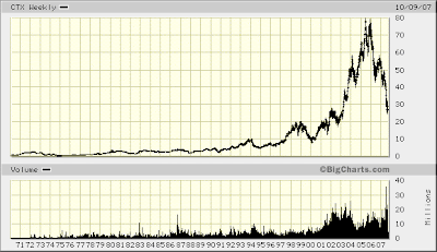
Pictures of Mania: Nasdaq and Homebuilders
Chart of homebuilder KB Home (KBH):
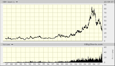
Chart of homebuilder D R Horton (DHI):
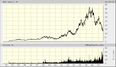
Chart of homebuilder Ryland Group (RYL):
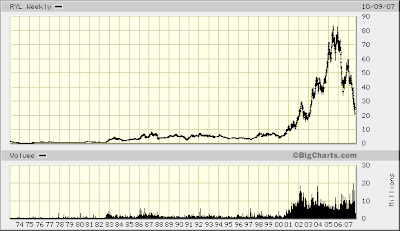
Chart of homebuilder Lennar Corporation (LEN):
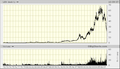
Chart of homebuilder Pulte Homes (PHM):
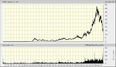
Chart of homebuilder Centex Corporation (CTX):
Compare all these homebuilder stocks to Nasdaq:


Chart of homebuilder D R Horton (DHI):

Chart of homebuilder Ryland Group (RYL):

Chart of homebuilder Lennar Corporation (LEN):

Chart of homebuilder Pulte Homes (PHM):

Chart of homebuilder Centex Corporation (CTX):

Compare all these homebuilder stocks to Nasdaq:

Subscribe to:
Posts (Atom)